
So that I might see: Data modeling and visualization
Catch the wind
Another hugely compelling example, in my mind, is neither new nor tech-related. But it is a stunning representation of one of the most ancient, ethereal and elusive forces that I can easily bring to mind. HINT.FM’s Wind Map (Fig. 2) uses near-term wind forecasts, updated once per hour, to provide a “living portrait” of wind speed and direction across the continental U.S.
It’s gorgeous, looking like the pelt of a silver fox, animated with swirling and undulating lines that hypnotize as they inform. It’s more art project than reliable weather map, but it’s undeniably - and visually - powerful.
Getting your head around it
Of course, data visualization doesn’t have to be a reliable real-time guide in order to be useful and powerful. A well-wrought model, artfully visualized, can make a lasting impression and can convey relationships with a sort of accuracy that few other media possess.
Take our solar system, for instance. You’ve seen models your whole life. There’s no shortage of visual representations of the solar system, often rendered from balls of Styrofoam at 4th grade science fairs. But those models are terrible visual representations of what our cosmic neighborhood actually looks like, in part because they ignore the fact that the vast majority of outer space is… just that. Space. Enormous expanses of relatively empty space.
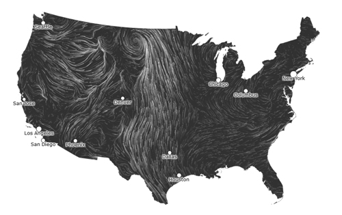
Fig. 2 - HINT.FM's Wind Map - Data Visualization Model
The scale of such a thing—millions of miles between recognizable celestial bodies—is something most people do not or perhaps cannot properly grasp. Which leads me to interactive media designer Josh Worth’s project, “If the moon were only one pixel.” The project, which Worth describes as “tediously accurate” does sort of the opposite of what many visualizations do. Rather than condensing data into the most easily digestible format possible, it expands itself to accurately encapsulate the massive scale of our solar system. If the moon were the size of one pixel on your screen, how large would the sun, Jupiter, Mercury or Mars be? How far apart would we be from the moon or Neptune? The space between objects is the real star here. Negative space.
It’s not a perfect representation: it is perfectly linear, assuming perfect planetary alignment, and represents average distances, not allowing for orbital differences. But that’s what makes it a model, and for my money, it’s the most effective model of the nature of our solar system and, when extrapolated, our universe.
And my point here? I know these visualizations don’t have any direct bearing on the communications technology space. My point is that we are only beginning to crack the code of what data modeling and visualization are capable of in the technology space.