So that I might see: Data modeling and visualization
By: Tim Young
 Presentation matters.
And I’m not just talking about a Tiffany blue box or an Apple Store. I’m not talking about pure aesthetics, though those never, ever hurt.
However, I’m talking about business intelligence, and the path that turns data into something useful in the C-suite and the other corners of the business not occupied by engineers. And this presentation—this translation of esoteric data into meaningful, well-modeled, visually interesting and intuitive formats—is something that we’ve gotten much better at in recent years, both in the integrated communications and entertainment (ICE) technology space and in the world at large.
But what can complex information look like when represented well (and, if possible, beautifully)? There are a few examples that have struck me as capable of conveying a tremendous amount of information in a way that’s intuitive enough to convey meaning even to the uninitiated and sticky enough to help viewers retain that information and understand complex interrelations long after the first view.
Change over time
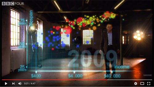
One of the most enduring examples of complex data presented beautifully that leaps to mind is Professor Hans Rosling’s “200 Countries, 200 Years, 4 minutes” (Fig. 1). And for those familiar with the presentation, you will note that it’s pretty old, as these things go, having appeared on BBC Four’s “Joy of Stats” (scintillating title, no?) nearly six years ago.
But what Rosling accomplishes in such a simple presentation is, when you think about it, quite remarkable. It plots 120,000 data points in a way that’s visually compelling, but that’s only so interesting. I mean, what’s a mere 120,000 data points to a communications service provider with millions of subscribers around the world engaged in all manner of activity around the clock?
But the presentation does more than plot thousands of numbers. It demonstrates independent global population trends behaving independently and in concert over two centuries. It converts data into a visual language that can be easily interpreted by the human mind. That’s powerful.


